Centralys
- Role
- Lead Product Designer
- Scope
- Product strategy · Research · UX/UI · Prototyping
- Product
- EdTech · LMS · B2B SaaS
- Context
- Client project
Learning management system
Turning instructor-led training into a scalable self-service learning experience.
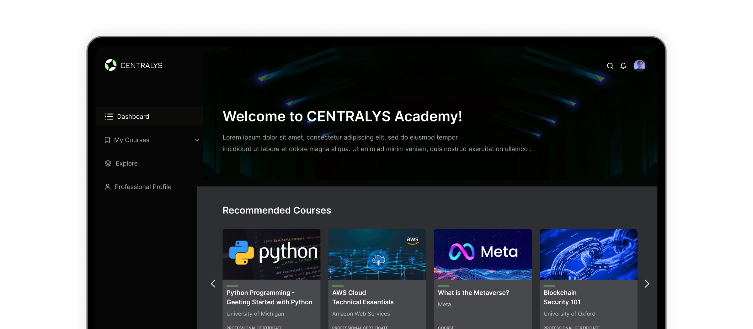
Centralys is a learning management platform designed to help learners complete technical and professional courses while giving administrators the tools to manage content, enrollment and progress.
I led the product design across the learner and administrator experience — simplifying course discovery, onboarding and progress tracking while designing a scalable interface for both desktop and mobile.
The Problem
Learning had to become self-service without becoming harder to navigate.
01
Two very different users
Learners needed a simple experience for finding and completing courses, while administrators needed deeper controls for managing content, users and enrollment.
02
Technical content could feel overwhelming
Course material needed to remain structured and approachable even when the subject matter was complex or highly technical.
03
Progress needed to stay visible
Moving from instructor-led learning to self-service meant learners had to understand where they were, what was complete and what to do next without relying on an instructor.
Discovery & Research
What we learned
I spoke with learners, administrators and stakeholders to understand where the existing training experience created friction across onboarding, course navigation and management workflows.
01
Learners needed orientation, not more content.
Course content already existed; the bigger problem was helping people understand where to begin, what to continue and what remained.
02
Administrators needed control without complexity.
User management, enrollment and course administration had to remain powerful without exposing unnecessary complexity to learners.
03
The experience had to work across contexts.
Learners might move between desktop and mobile, so navigation, course status and progress needed to stay understandable across screen sizes.
Design decision 01
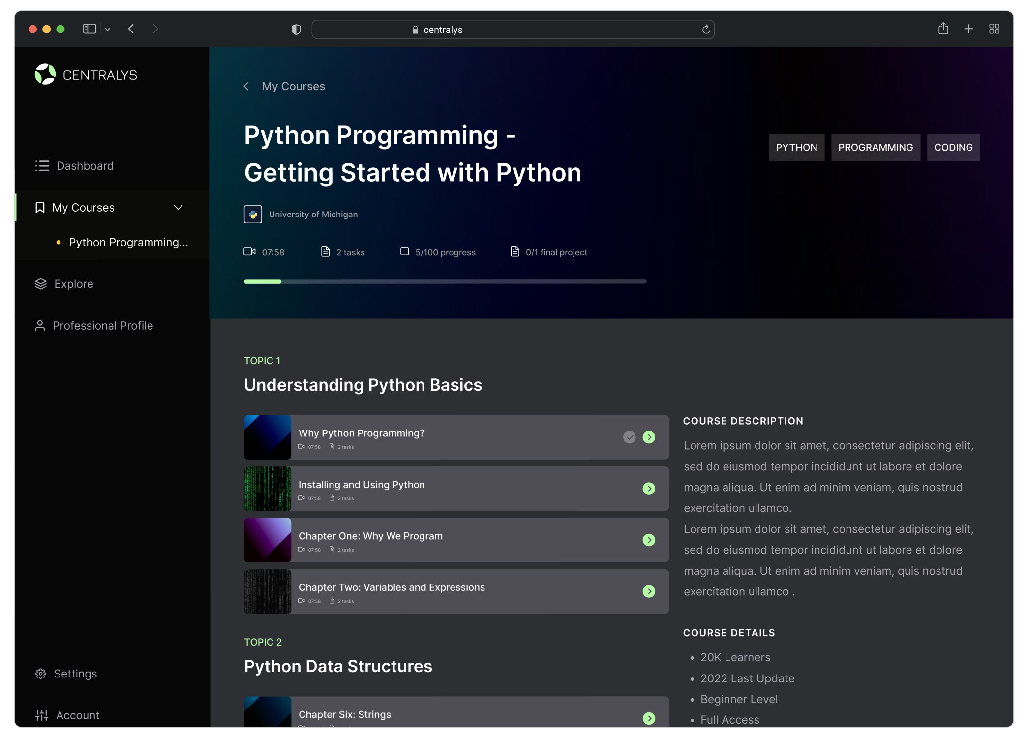
Giving learners a clear path through technical courses
Self-paced learning creates a different navigation problem from instructor-led training: learners need to understand what they are currently studying, how much is complete and what comes next without asking an instructor for orientation.
I structured the course experience around clear topic groupings, progress states and visible course hierarchy so learners could move through long-form technical material without losing context.
01
Visible progress
Make completion and remaining work understandable at a glance.
02
Structured course hierarchy
Organize content into clear topics and lessons so long courses remain navigable.
03
Persistent context
Keep course identity, progress and current location visible while learners move through content.
Design decision 02
Making course discovery feel approachable
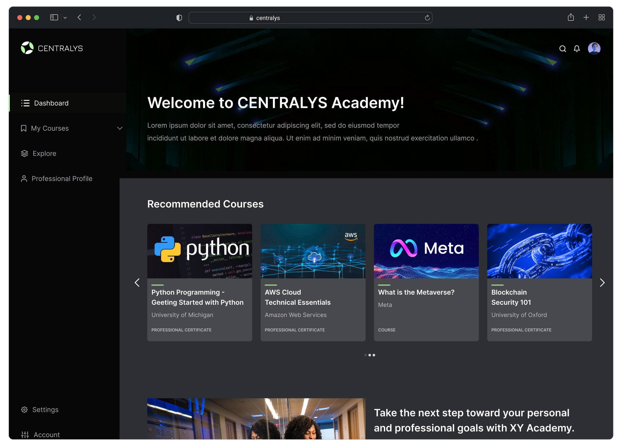
Technical learning libraries can become difficult to scan as the number of courses grows. The discovery experience needed to help learners identify relevant content quickly without making the interface feel like a dense catalogue.
I used recognizable course cards, visual hierarchy and grouped recommendations to make browsing lightweight while still communicating provider, subject and course type.
01
Scannable course cards
Surface title, provider and course type without overloading the card.
02
Recommendation hierarchy
Separate recommended and certificate content so users can understand why courses are being surfaced.
03
Consistent visual language
Use predictable card patterns so learners can compare content quickly.
Mobile experience
Keeping learning usable away from desktop
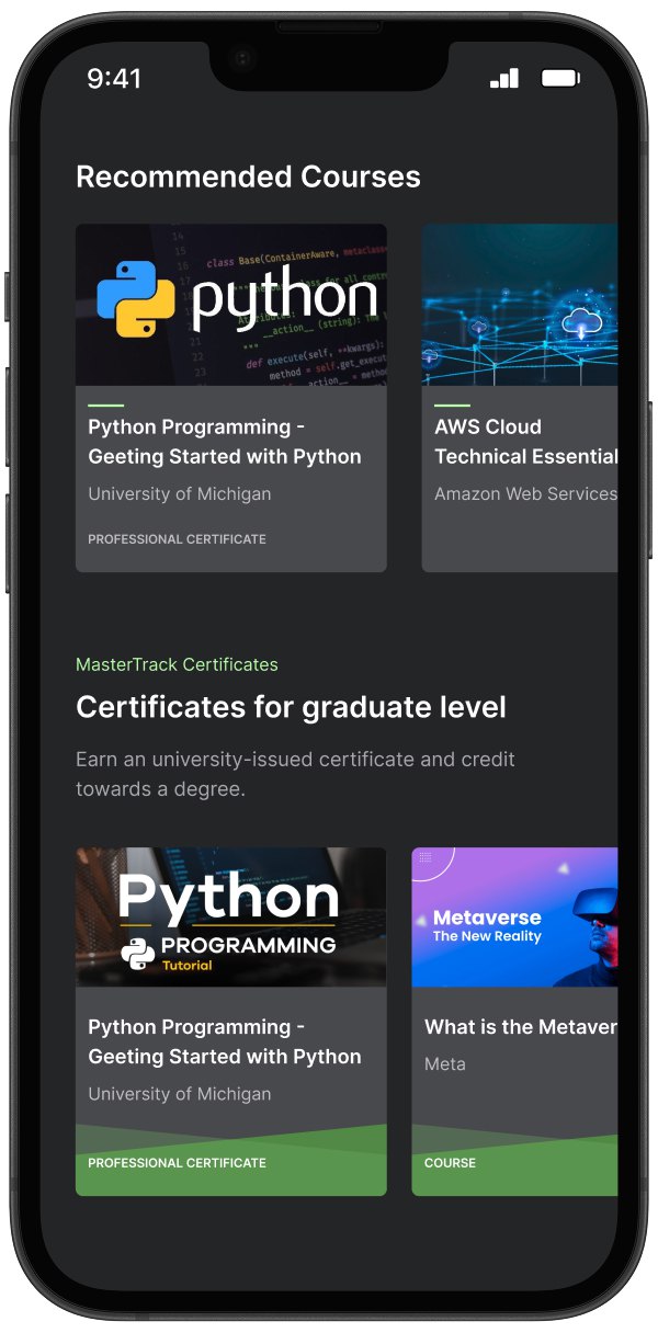
Learners would not always complete training from a desktop environment, so the mobile experience needed to preserve the same orientation as the larger interface without simply compressing it.
I adapted course discovery and content browsing around smaller screens, prioritizing essential actions, readable cards and clear progress while removing unnecessary desktop density.
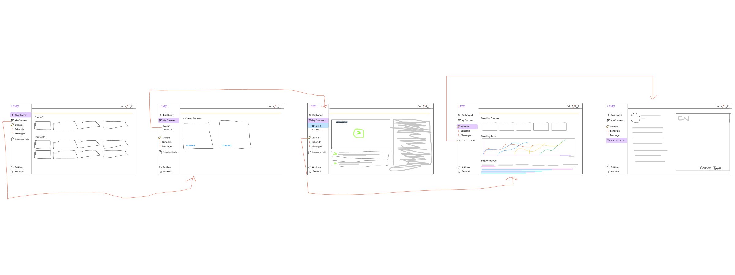
Early exploration
From learning flows to interface structure
Before moving into high-fidelity design, I mapped the learner journey across discovery, course selection, lesson progress and completion, while also considering the management workflows required on the administrator side.
Outcome & Impact
The redesigned experience helped Centralys move from primarily instructor-led delivery toward a more scalable self-service learning model.
Clearer course navigation, progress visibility and onboarding reduced friction for learners, while reusable interface patterns allowed the product to support both lightweight learner experiences and denser administrative workflows.