HomePro
- Role
- Lead Product Designer
- Scope
- Research · Product strategy · UX/UI · Prototyping
- Product
- PropTech · FinTech
- Context
- Client project
Digital homebuying & mortgage platform
Making a complex mortgage journey easier to understand and complete.
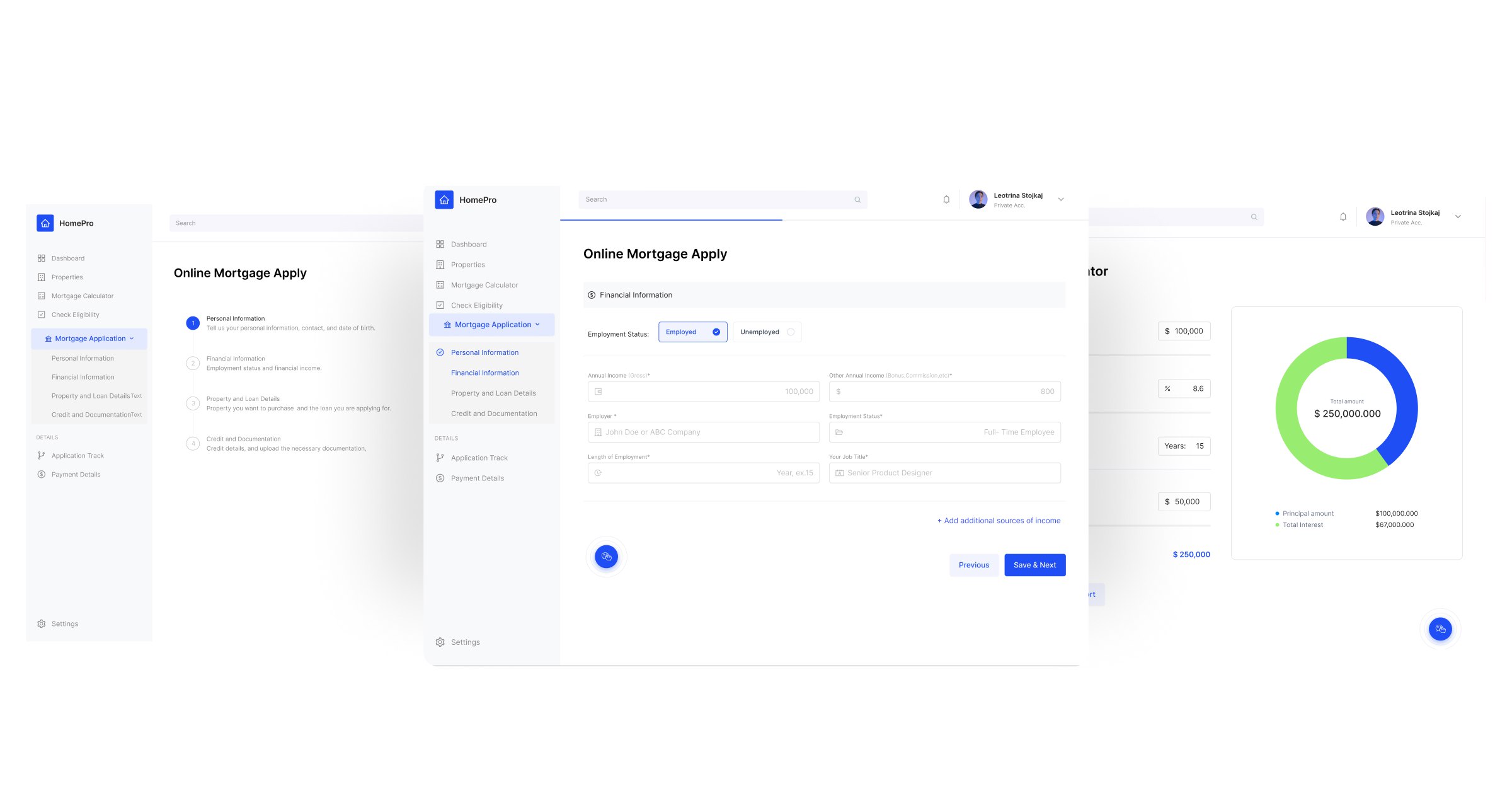
HomePro brings property discovery, mortgage eligibility and the application process into one digital experience, reducing the fragmentation typically involved in financing a home.
I led the product design from research and journey mapping through prototyping and validation, focusing on how to simplify complex financial workflows without removing the information users needed to make confident decisions.
The Problem
Buying a home was already complicated. The digital experience made it harder.
Mortgage applications combine unfamiliar terminology, financial decisions, document requirements and long waiting periods. For first-time buyers especially, users were being asked to make consequential decisions without always understanding what was required or what would happen next.
01
Too much documentation
Users described paperwork and document requirements as one of the most frustrating parts of the mortgage process.
02
Financial language created uncertainty
Mortgage terminology and comparisons were difficult to understand, making already high-stakes decisions feel even more intimidating.
03
The process lacked orientation
Users needed clearer guidance about what information was required, how far they had progressed and what would happen next.
Research
Understanding where confidence breaks down
I conducted 25 user surveys and 5 in-depth interviews to understand homebuying behavior, pain points and the decisions users struggled with most.
What frustrated users most
40%
Lengthy paperwork and documentation
30%
Complex jargon and terminology
30%
Difficulty comparing mortgage options
What users asked for
45%
Streamlined document upload and management
35%
Clearer explanations and guidance
20%
Real-time support
What we learned
Complexity wasn’t only about the number of steps
Experience level changed what help looked like: first-time buyers needed more explanation and reassurance, while experienced buyers valued speed and visibility.
01
Users needed to know what came next.
Uncertainty increased when users could not understand their position in the application or what information would be required later.
02
Documents created both effort and anxiety.
The problem wasn’t simply uploading files — users needed to understand which documents were required, why they were needed and whether anything was missing.
03
Financial decisions needed explanation.
Simplifying the interface could not mean hiding important information. Users still needed enough context to understand eligibility, mortgage options and financial implications.
Mapping the journey
Seeing the mortgage application as one connected flow
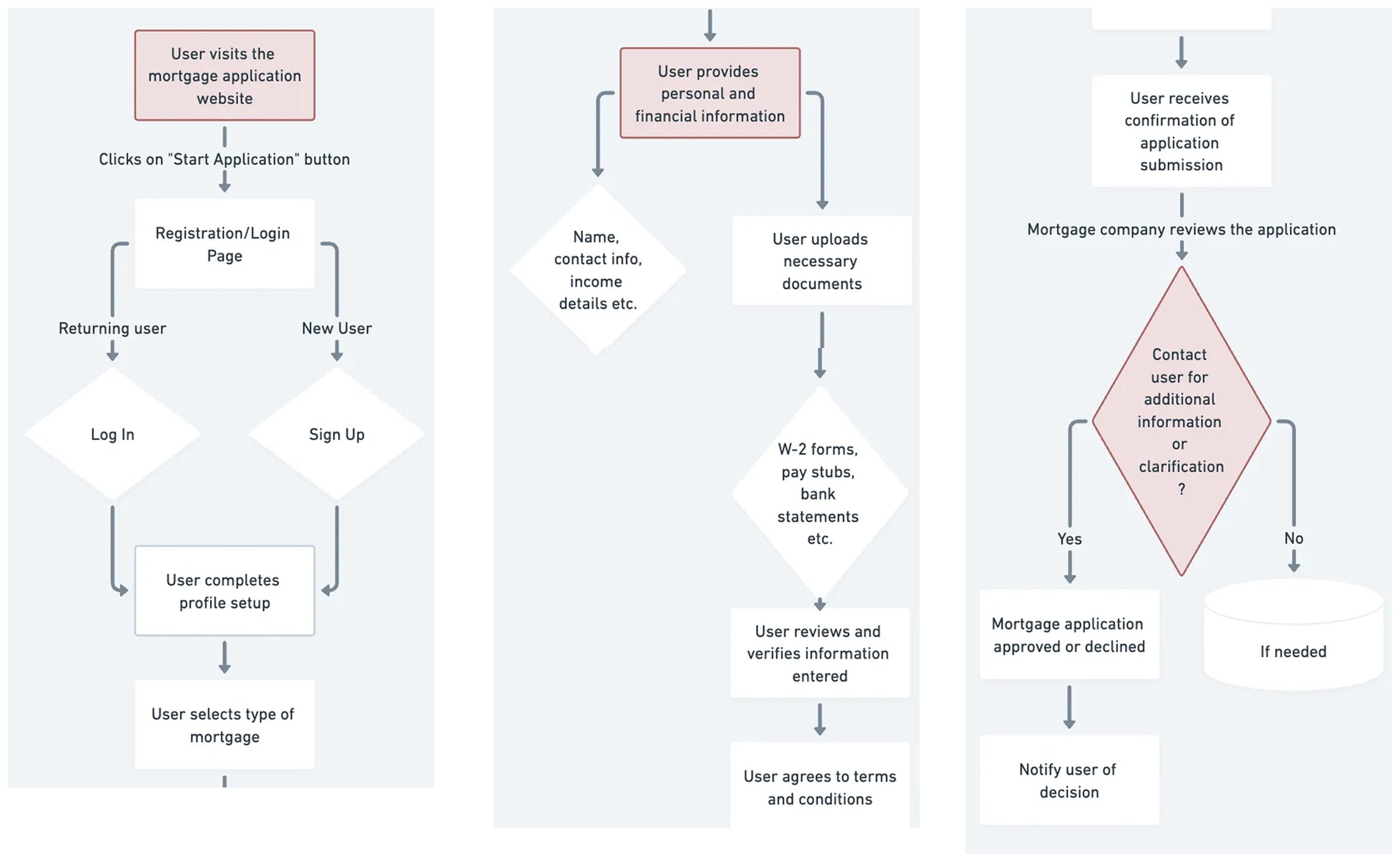
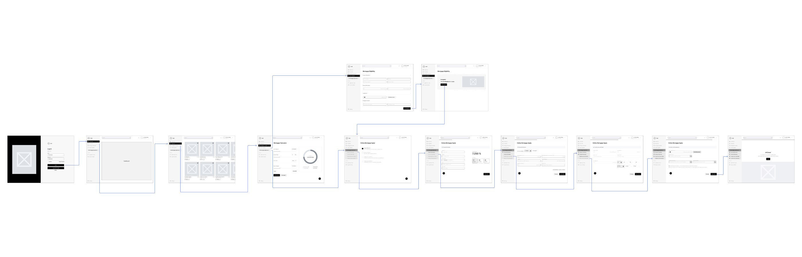
Before designing individual screens, I mapped the end-to-end application journey — from account creation and mortgage selection through financial information, document submission, review and the final decision. This exposed where users could lose context and helped determine which information needed to remain visible throughout the process.
Design decision 01
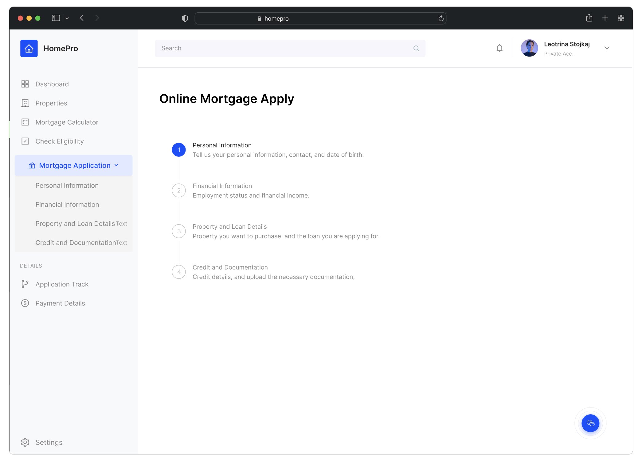
Turning one long application into understandable steps
A mortgage application requires a large amount of personal, financial and property information. Presenting everything at once would increase cognitive load and make the process feel even longer.
I broke the journey into clearly defined stages and kept progress visible so users could understand both their current task and what remained before submission.
01
Visible progress
Show where users are and what remains before completion.
02
Logical grouping
Separate personal, financial, property and documentation information into understandable stages.
03
Clear next actions
Make the next required action obvious without exposing the entire application at once.
Design decision 02
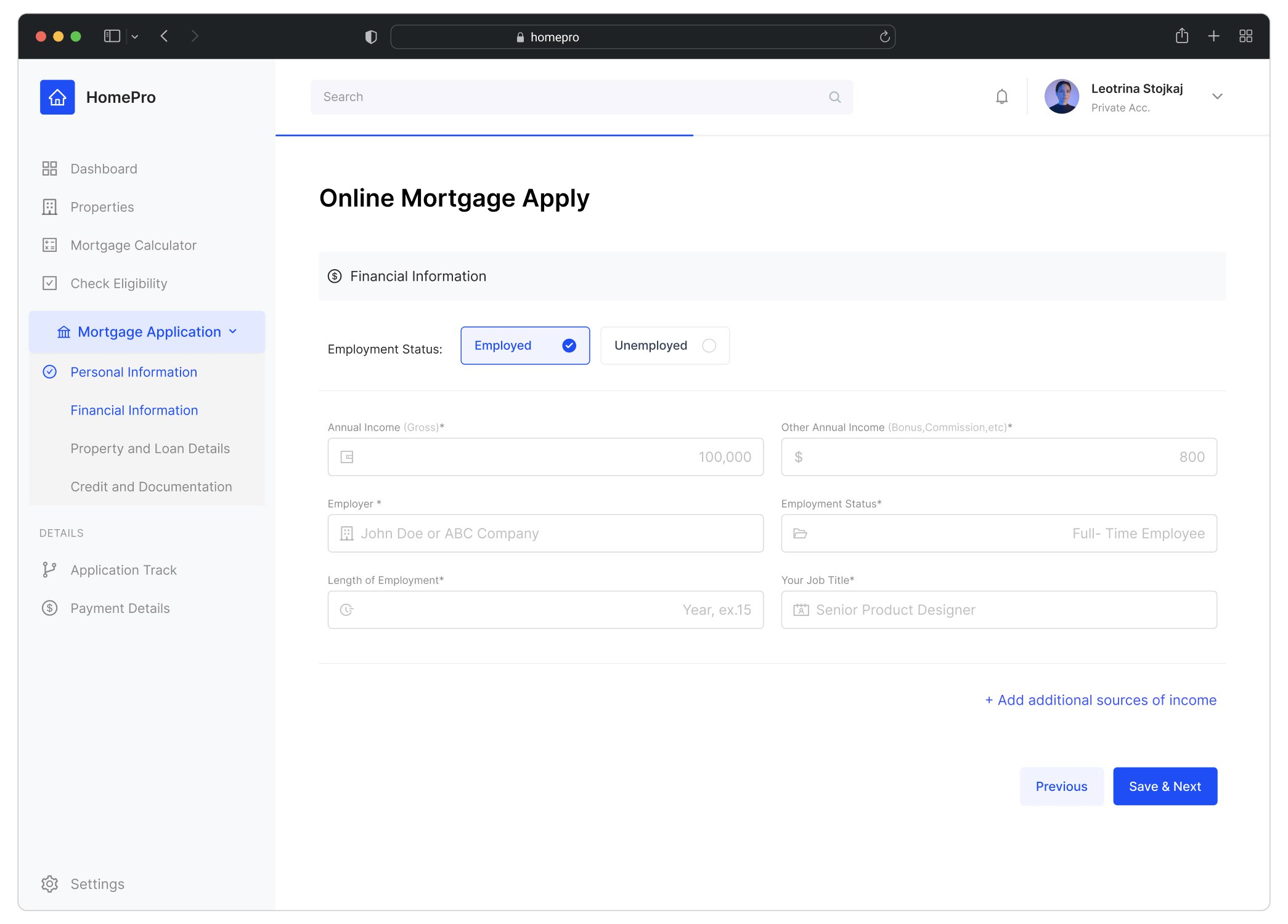
Reducing form complexity without removing important detail
Financial forms cannot always be made short, but they can be made easier to process. The goal was therefore not simply to remove fields — it was to structure the information so users could focus on one decision at a time.
Fields were grouped around meaningful financial concepts, while the interface preserved context through navigation, progress and clear actions between stages. Access to help sits inside the application itself, so users can get assistance at an unfamiliar requirement without abandoning the task in front of them.
01
Progressive disclosure
Only expose the information required for the current stage.
02
Meaningful grouping
Organize fields according to the decisions users are making rather than presenting one continuous form.
03
Recoverable navigation
Allow users to understand where they are and move between application stages without losing orientation.
Design decision 03
Making financial estimates easier to interpret
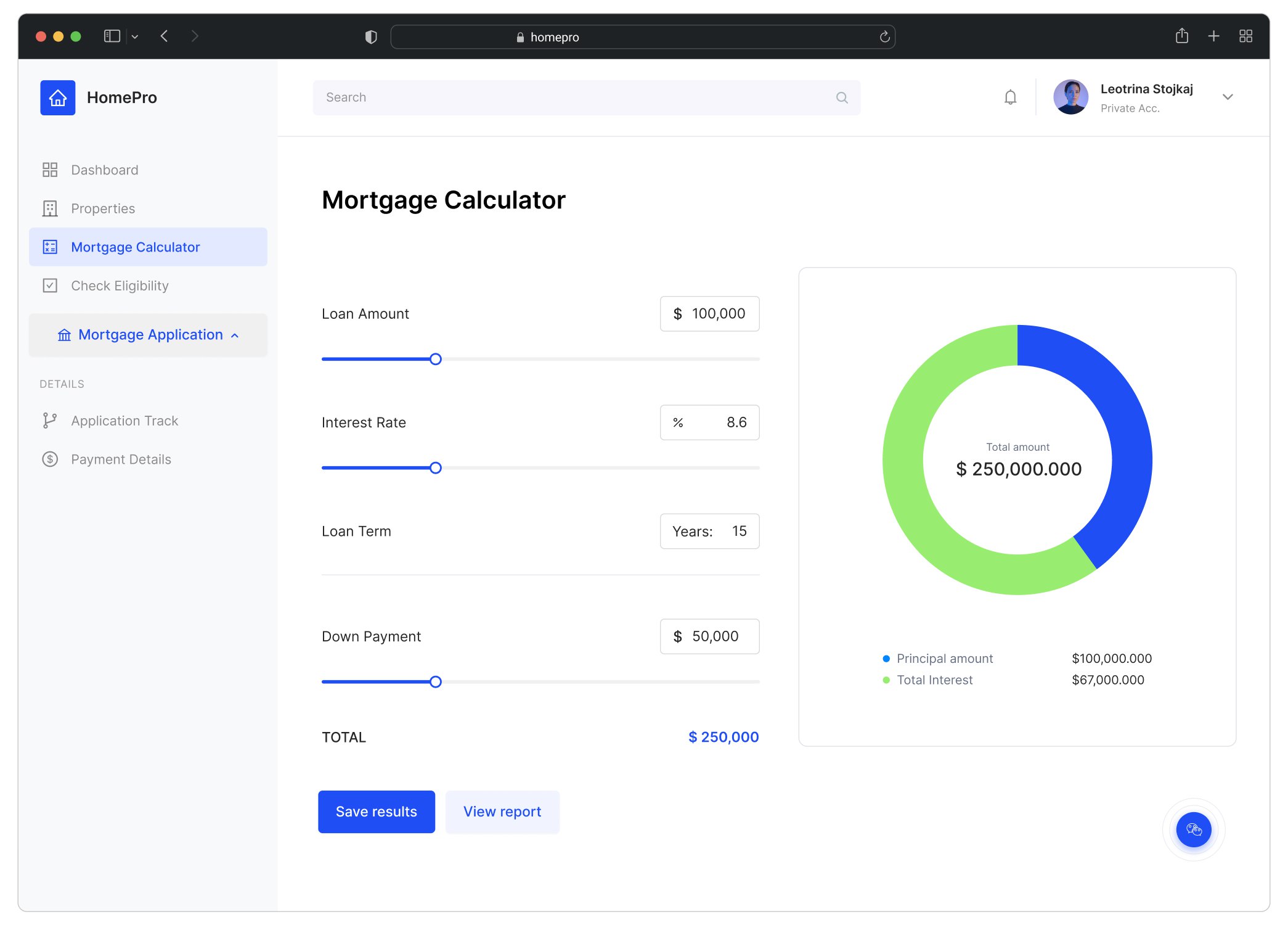
Mortgage calculations are useful only when users can understand what the numbers mean for them. The calculator needed to support exploration without making users decode a dense financial interface.
I paired adjustable inputs with immediate visual feedback so users could explore loan amount, interest rate, term and down payment while seeing how those decisions affected the resulting mortgage.
01
Interactive inputs
Let users adjust the variables that directly affect their mortgage scenario.
02
Immediate feedback
Update the financial result as users explore different inputs.
03
Visual comparison
Use simple visual representation to make the relationship between principal and interest easier to scan.
From exploration to validation
Testing the journey before shipping the interface
The mapped mortgage journey became progressively more detailed flows and wireframes, working through how users move between property discovery, eligibility and application tasks without losing context.
I built interactive prototypes in Figma and ran multiple rounds of usability testing using Userberry, iterating around document handling, application progress and the clarity of key financial workflows.
Outcome & Impact
A clearer path through a high-friction financial journey
The redesigned experience made the mortgage journey easier to navigate by turning a fragmented, document-heavy process into a more structured digital flow.
The redesigned flow reduced friction across key mortgage tasks and created a clearer path through the application experience, while preserving the financial information needed to make confident decisions.