Dibz
- Role
- Lead Product Designer
- Scope
- Product strategy · Research · UX/UI · Prototyping
- Product
- PropTech · B2C SaaS
Housing queue automation
Making Sweden’s fragmented housing queues easier to manage — for individuals and families.
Dibz helps users track and manage housing queues across more than 200 housing providers from one place, reducing the complexity of Sweden’s fragmented housing market.
I led product design across key parts of the experience — onboarding, queue discovery, dashboard improvements and the introduction of Family Accounts — evolving the product from a primarily individual experience into one that could support entire households.
4.6★Trustpilot rating
Product context: the platform’s public Trustpilot rating, not a measure of the design work described here.
The Problem
Housing queues were already fragmented.
Managing them as a household added another layer of complexity.
01
Fragmented ecosystem
Users had to navigate housing opportunities across 200+ independent housing providers, making it difficult to understand where they stood and what required attention.
02
Single-user architecture
The product was originally structured around individual users, while couples and families often needed to coordinate housing queues together.
03
Sensitive shared information
Supporting households introduced questions around account ownership, invitations, profile switching, status and personal information — without making the product feel significantly more complex.
Discovery & Research
What we learned
I spoke with families, students and individual users to understand how they managed housing queues, where the existing experience created friction, and how shared housing decisions affected account management.
01
Housing search was often collaborative.
Although accounts were designed around individuals, housing decisions frequently involved partners or family members managing opportunities together.
02
Switching people couldn’t feel like switching accounts.
Household members needed a fast way to move between profiles without repeatedly logging out, logging in, or losing context.
03
More functionality couldn’t mean more complexity.
Family Accounts introduced additional states, invitations, ownership and profile information, but the core experience still needed to remain understandable at a glance.
Design decision 01
Turning individual accounts into households
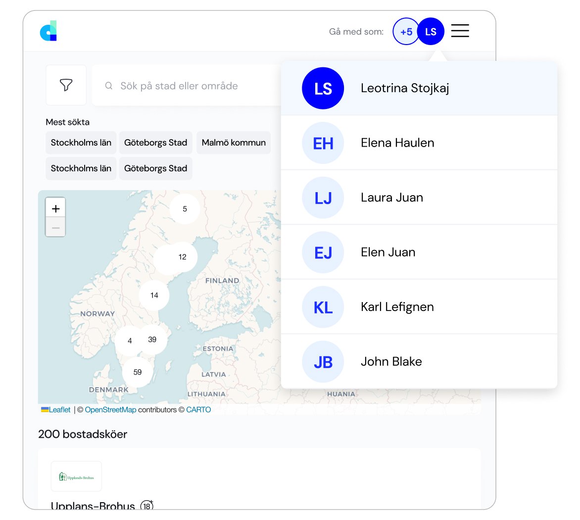
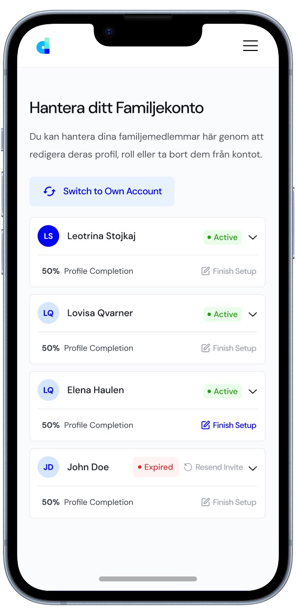
Introducing Family Accounts meant adding multiple people to a product originally centered around a single user. Rather than treating each family member as a separate account experience, the household model preserved individual profiles while making switching between them immediate and understandable.
The system had to communicate who the user was acting as, account ownership, invitation status, profile completion, and active or expired states — without overwhelming the interface.
01
Instant profile switching
Move between household members without logging out or losing context.
02
Clear account states
Make active, expired, invited and incomplete profiles immediately distinguishable.
03
Visible next actions
Use profile completion and setup states to show what still requires attention.
Design decision 02
Making 200+ housing providers navigable
The value of Dibz depends on helping users discover and manage opportunities across a fragmented network of housing providers.
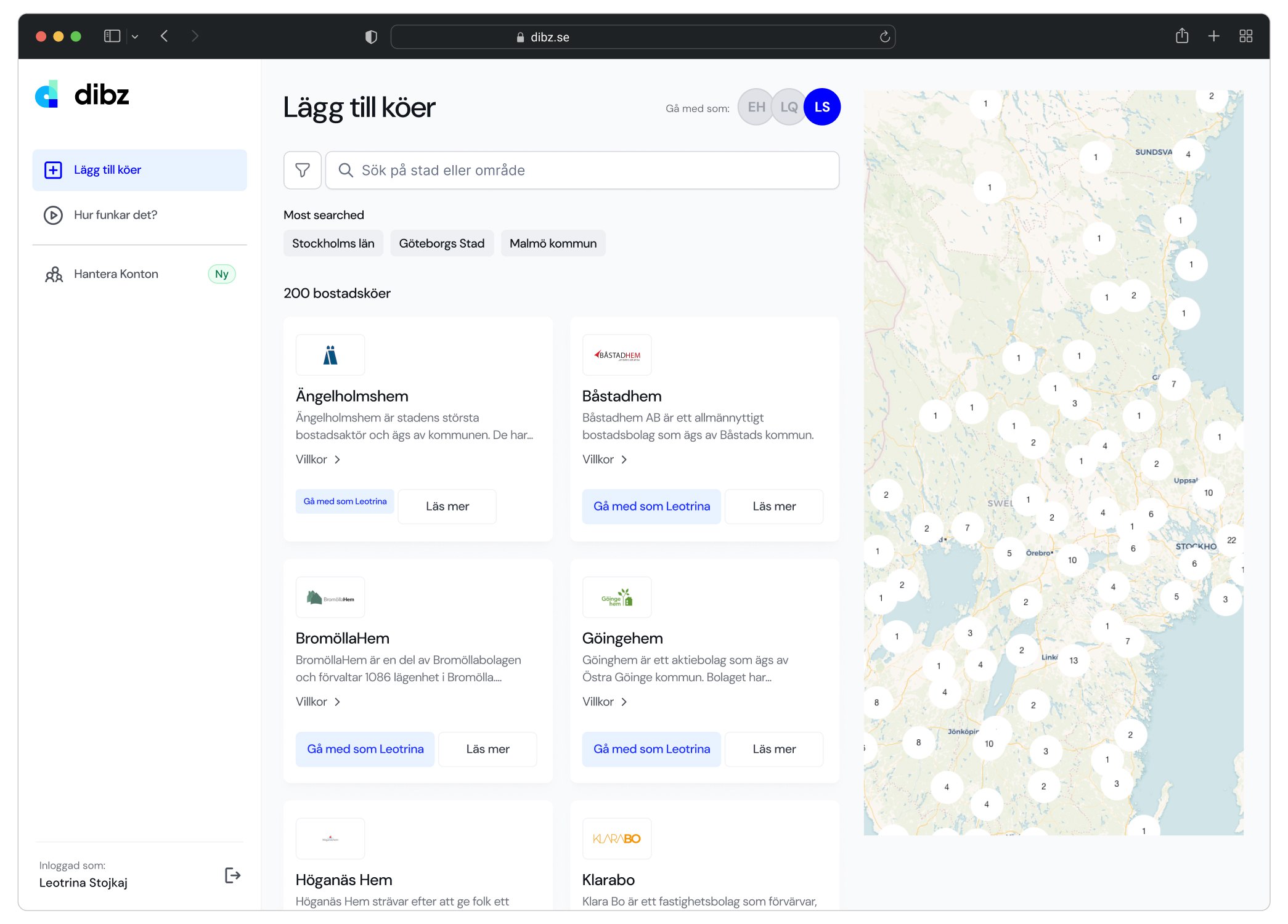
Queue discovery is built around both browsing and geographic orientation, combining searchable provider cards with a map so users understand not only what queues are available, but where those opportunities exist.
01
Search and filtering
Give users a direct route to a known city, area or provider.
02
Map orientation
Make a fragmented national housing ecosystem spatially understandable.
03
Scannable providers
Use consistent cards and actions so users can evaluate many providers quickly.
Design decision 03
Turning queue data into orientation
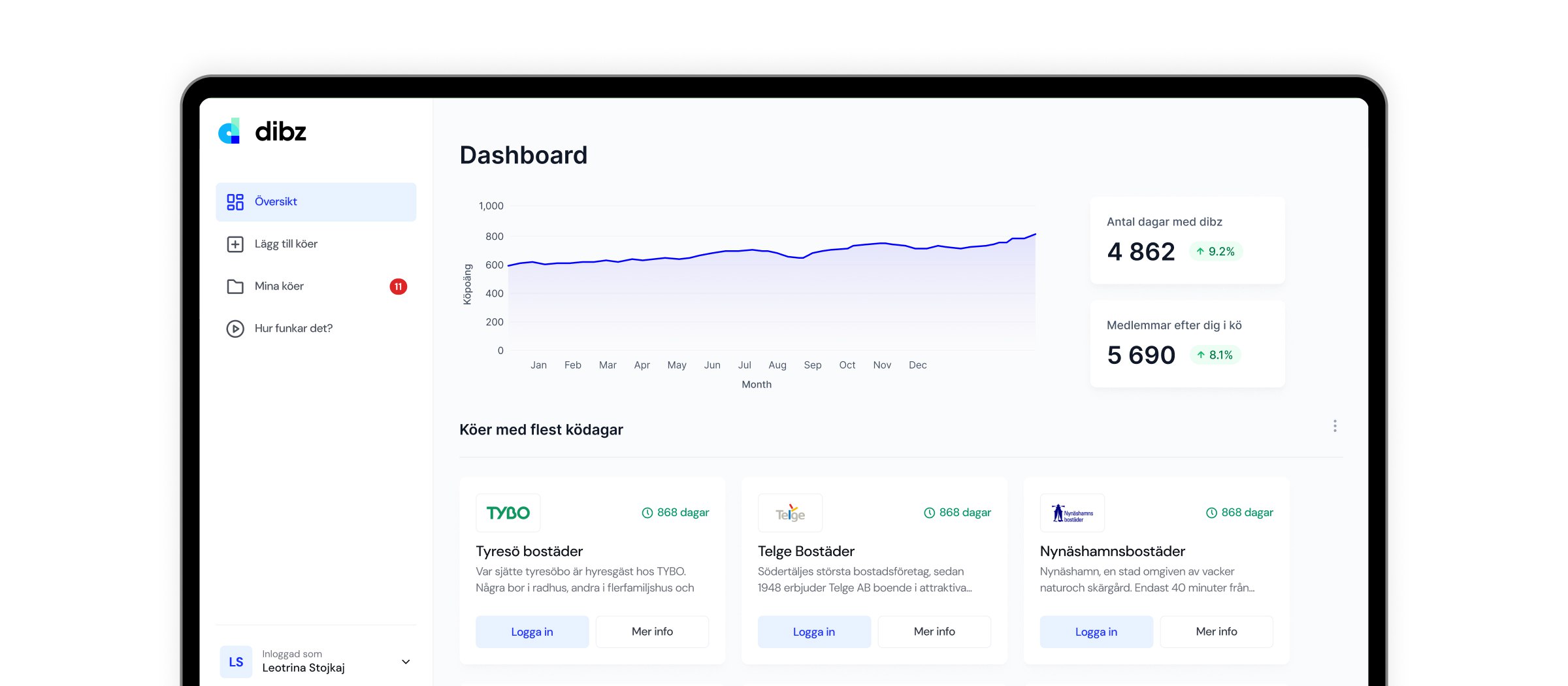
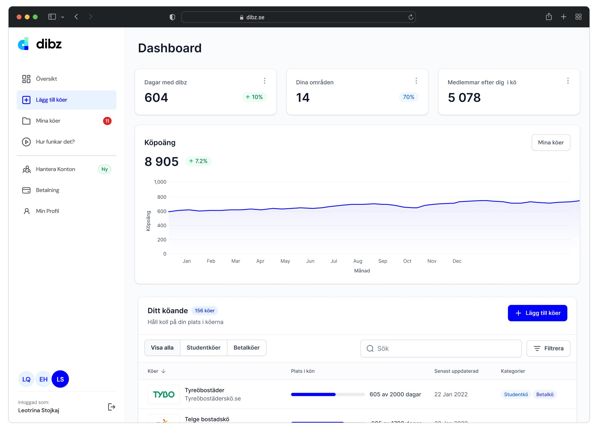
Tracking housing queues is a long-term process, so the dashboard needed to answer one question quickly: where do I stand?
The experience is organized around what people need for orientation — time spent in queues, current memberships, people ahead of or behind them, and the queues requiring attention — while keeping deeper information one step away.
Mobile experience
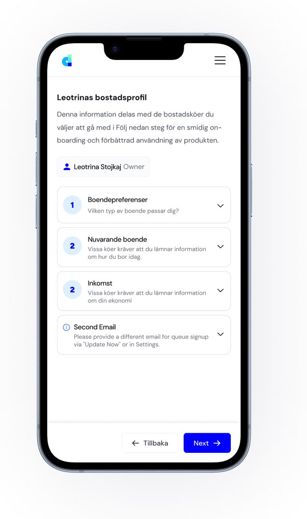
Reducing friction when setting up a housing profile
Family Accounts increased the importance of getting profile information right. The mobile experience is split into clear sections, so it is obvious what information is required, what has already been completed, and what still needs attention.
Outcome & Impact
The work helped evolve Dibz beyond individual queue management into an experience capable of supporting shared household workflows through Family Accounts.
Across the broader product, clearer queue discovery, profile management and status visibility made a fragmented housing process easier to navigate while the platform continued serving a growing user base.
4.6★Trustpilot rating